Letterforms
Letters taken apart in openly licensed typefaces: the names of their parts, the optical corrections designers make for the eye, and the spacing between them.
4 entries
Definitions: the eye's thumb on the scale
-
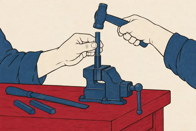
Anatomy of a Letter: Why the O Is Drawn Taller Than the H
The parts of a letter, from baseline and x-height to stem, bowl, counter, serif and terminal, measured in two open fonts, and why the O is drawn taller than H.
 Illustration
Picture credit
Illustration: Codes & Letters. Generated schematic image — not a photograph or historical record. Reuse: CC BY 4.0 (https://creativecommons.org/licenses/by/4.0/), to the extent any copyright exists in this image. -
X-Height: Same Font Size, Different Letter Sizes, Measured
X-height measured from 13 open font files: at one font size, the lowercase x stands 40.5% of that size in EB Garamond and 55.0% in JetBrains Mono.
Picture credit
"Hydesville CA Interchange" by Ellin Beltz — Public domain (released into the public domain by the photographer, Ellin Beltz, who also grants anyone the right to use it for any purpose where such a release is not legally possible; the sign shows only place names, distances, arrows and a route shield) — https://commons.wikimedia.org/wiki/File:Hydesville_CA_Interchange.jpg -
Serif vs Sans Serif: Reading Tests Found No Clear Winner
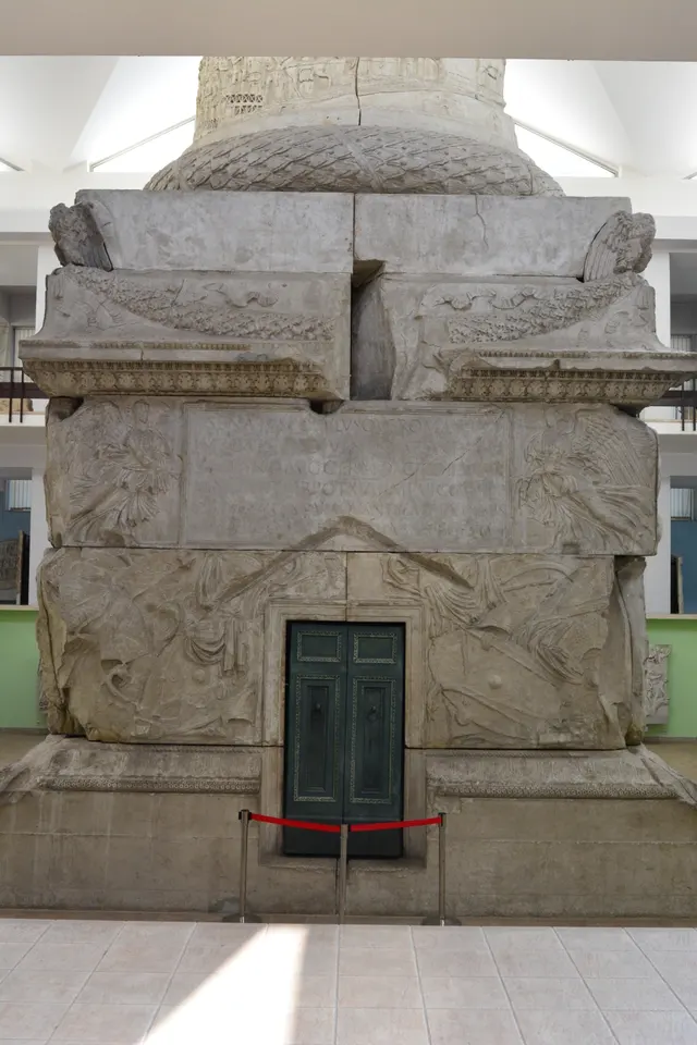
Serif vs sans serif: reading tests that change only the serifs find no clear winner. Studies side by side, the Trajan inscription, and measured Noto font data.
Picture credit
"Trajan's Column - NMR - base - 02" by Joe Mabel — https://commons.wikimedia.org/wiki/File:Trajan%27s_Column_-_NMR_-_base_-_02.jpg — CC BY-SA 4.0 (https://creativecommons.org/licenses/by-sa/4.0/) -
Kerning: Space Six Words by Eye, Then Check the Font
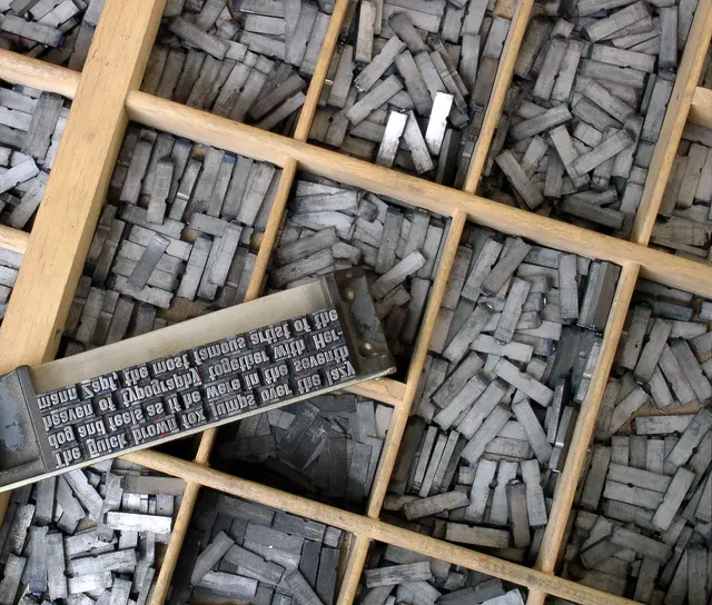
Kerning is the spacing a font file stores for one pair of letters. Spectral pulls A and V 80 units closer, yet 84% of pairs in three English novels get none.
Picture credit
"Metal movable type" by Willi Heidelbach — https://commons.wikimedia.org/wiki/File:Metal_movable_type.jpg — CC BY 2.5 (https://creativecommons.org/licenses/by/2.5/); modifications: cropped at the left to remove a maker's stamp on the composing stick's clamp, scaled to 1600 px wide


