Anatomy of a Letter: Why the O Is Drawn Taller Than the H
Codes & Letters
- Published
- Last substantive revision
LetterformSpec card
- Part or effect
- OvershootSource: FontForge glossary; Google Fonts Knowledge glossary
- Typeface measured (version)
- Noto Sans 2.015 Regular (wght 400)Source: Noto Sans font file, SIL Open Font License 1.1
- Measurement
- H: 0 to 714 font units; O: −10 to 725 (1,000 units per em)Source: this page's measurement of the font file
- Comparison typeface
- Spectral 2.005 Regular: H 0 to 660; O −10 to 670Source: this page's measurement of the font file
anatomy-spec.csv the values on this card, as CSVData: Measured from Noto Sans Version 2.015, Copyright 2022 The Noto Project Authors (https://github.com/notofonts/latin-greek-cyrillic), SIL Open Font License 1.1, retrieved 2026-10-16; Measured from Spectral Version 2.005, Copyright 2017 The Spectral Project Authors (https://github.com/productiontype/Spectral), SIL Open Font License 1.1, retrieved 2026-10-16
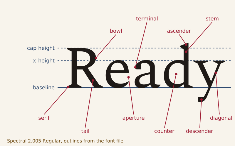
The word Ready in Spectral Regular, with three guidelines and ten named parts. The outlines come from the font file.
In Noto Sans Regular, the capital O is 735 font units tall and the capital H only 714. That difference is deliberate. A round letter drawn exactly as tall as a flat-topped one tends to look smaller, so its curves are made to run slightly past the lines that bound the H, a correction called overshoot.
The other pieces of a letter have names too. A letter sits on a baseline and reaches up to the x-height or the cap height. It is built from stems, bowls and arms. The spaces its strokes enclose are counters and apertures, and the strokes end in serifs or terminals.
This page names those parts in two fonts released under the SIL Open Font License, Spectral and Noto Sans, and measures them from the font files. Names vary from one source to the next. Each name below comes with the source that uses it.
What are the lines a letter sits on?
Google Fonts Knowledge lists five vertical measurements for Latin type: ascender, cap height, x-height, baseline and descender. The baseline is the line the letters sit on and the point from which the others, such as the x-height, are measured. The FontForge glossary defines the x-height as the height of lowercase letters with flat tops, such as x, z and v. Google Fonts Knowledge adds that the measurement leaves out ascenders and overshoot, which is why the flat x gives it its name.
The cap height is the same measurement for capitals with flat tops, such as H and E. An ascender is the part of a lowercase letter that rises above the x-height, like the stem of b or d, and a descender is the part that drops below the baseline, like the stem of p.
By this page's measurement of the Spectral Regular font file, on a grid of 1,000 units per em, the baseline is 0, the x-height 450, the cap height 660, the top of d 750 and the bottom of p −230. So the ascender of d stands 90 units taller than the capitals, as Google Fonts Knowledge says ascenders usually do. Noto Sans Regular places the same lines at 536, 714, 760 and −240.
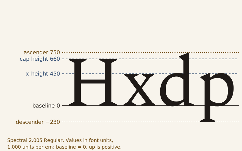
Spectral Regular's guidelines in font units: baseline 0, x-height 450, cap height 660, the top of d at 750 and the bottom of p at −230.
A font unit is a fraction of the em, a length equal to the type size. The FontForge glossary notes that PostScript fonts usually divide the em into 1,000 units, as both fonts here do, and Google Fonts Knowledge adds that at a font size of 16 pixels one em is 16 pixels. Spectral's 660-unit capitals therefore come out about 10.6 pixels tall at that size.
The font file also records the x-height and cap height in its OS/2 table, as distances from the baseline in font design units, the definition the OpenType specification gives. Why two fonts at the same size can look different in size is measured on the x-height page.
Stems, bowls, arms and tails
Google Fonts Knowledge defines a stroke as one of the main lines that make up a character, a word borrowed from penmanship. In its overview of Latin type anatomy, a stem is a letter's main vertical stroke, and the slanting strokes of y, v and k are diagonal strokes.
Older names survive alongside these. Edward Johnston's 1906 manual Writing & Illuminating, & Lettering sorts the parts of Roman capitals under headings for vertical stems, oblique strokes, horizontals and arms, bows and curves, serifs and tails. His arms include the horizontal strokes of E, F and L, and his tails are strokes such as those of K, Q and R. Microsoft's design standards for Latin type use bowl for the round part of P, the kind of curve Johnston groups under bows and curves.
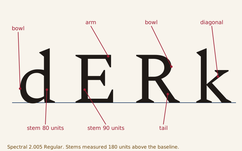
Strokes in Spectral Regular: the stem and bowl of d, the arm and stem of E, the bowl and tail of R, and the diagonal stroke of k.
Stems also have a measurable thickness. Measured at 40% of each font's x-height, the stems of lowercase n, l, m and d in Spectral are each 80 units thick, while the stems of capital H and E are 90. In Noto Sans the same measurement gives 88 units for the stems of l and d and the left stems of n and m, and 90 for the capitals.
The same stroke can go by several names. In Luca Pacioli's Divina proportione, printed in Venice in 1509, a woodcut capital A stands inside a square with a circle drawn in it. The Italian text below says the letter is drawn from the circle and its square and calls each stroke a gamba, a leg. By this page's reading of that text, the thick right-hand leg is one ninth of the letter's height, the thin left leg half of that, and the middle stroke a third of the thick leg.
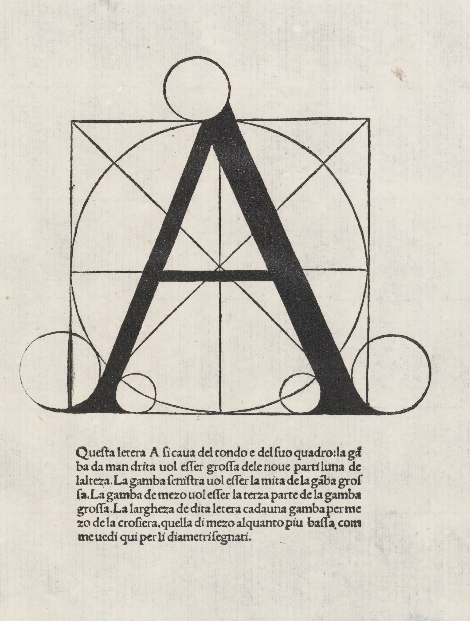

A page of Luca Pacioli's Divina proportione, printed in Venice in 1509: a capital A built on a circle inside a square, with Italian instructions below.
In this A, Johnston's oblique strokes and the diagonal strokes of Google Fonts Knowledge are Pacioli's legs. Johnston's headings come from a section on Roman capitals, the letters whose alphabet is traced on the Latin alphabet page.
What is a counter, and what is an aperture?
A counter is a space a letter's strokes enclose. Google Fonts Knowledge counts both closed counters, as in o and d, and open ones, as in c and u. It traces the name to traditional type production, in which a counterpunch made the hollows in the metal punch used to create letter molds.
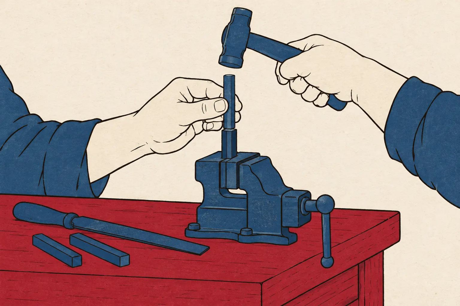 Generated illustration
Google Fonts Knowledge traces the word counter to the counterpunch, which made the hollows in the metal punch used to create letter molds.
An aperture is the opening of a counter. A Google Fonts Knowledge lesson by Niteesh Yadav lists the gaps in n, C and S, the lower part of e and the upper part of a two-story a, calling the aperture "essentially, the opening of the counter space." Even one source does not always keep the two words apart: the same site's overview of Latin type anatomy calls the opening of c a counter.
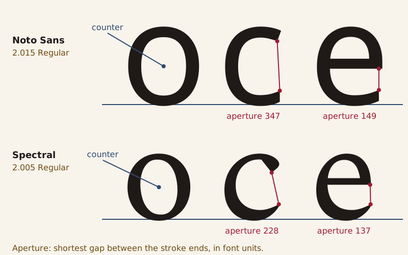
Counters and apertures in Noto Sans Regular (top) and Spectral Regular (bottom). Each red line spans the shortest gap between the two stroke ends.
None of the sources cited here gives a way to measure an aperture, so this page uses a simple one: the shortest straight gap between the two stroke ends. Measured that way, the opening of c is 347 units in Noto Sans and 228 in Spectral. Against each font's x-height, that is about 65% in Noto Sans and 51% in Spectral. The opening of e is closer between the two, 149 units against 137.
Where strokes end: serifs and terminals
A terminal is the end of a stroke. Google Fonts Knowledge says a terminal may or may not be a serif, and its examples run from the serifs on the bars of E to the ball that ends the stroke of a lowercase a. A serif is the mark or line that can appear at the end of a stroke, and the same word names the typefaces that use them.
Johnston called serifs finishing strokes and wrote in 1906: "Serifs of some sort are practically essential to the proper characterisation of an alphabet."
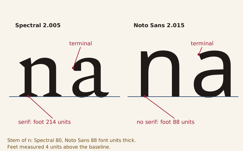
The foot of n and the top of a in Spectral Regular (left) and Noto Sans Regular (right). Feet measured 4 units above the baseline.
The difference shows at the foot of n. In Spectral, the left stem of n is 80 units thick, but its foot spans 214 units once the serif is included. In Noto Sans the same stem simply stops: its foot is 88 units wide, the width of the stem itself.
At the top of a, Spectral's stroke thickens into a heavy end with a flat underside, while Noto Sans cuts it off at a slant. Whether either kind of ending makes text easier to read is a separate question, taken up on Serif vs Sans Serif.
Why is the O taller than the H?
Set a capital O beside a capital H in Noto Sans Regular and read both outlines from the font file. The H runs from the baseline at 0 to 714 units, the same value the font stores as its cap height. The O starts 10 units below the baseline and stops at 725, 11 units above the top of the H. Neither number is a slip.
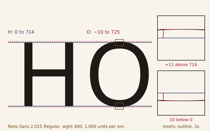
Noto Sans Regular: the H stops at 714 units, the O runs from −10 to 725. The insets enlarge the top and bottom of the O three times.
The FontForge glossary explains the gap: for the curved O to look as tall as a flat-topped capital, it tends to overshoot the cap height and undershoot the baseline. It traces the guideline to the way the eye works and to Peter Karow's book Digital Formats for Typefaces. Google Fonts Knowledge puts the other side of it: without overshoots, the eye reads round letters as shorter than the rest.
Microsoft's character design standards turn the idea into a rule for capitals: round capitals should drop below the baseline as far as their tops rise above the flat capitals. Noto Sans comes within a unit of that, 11 above and 10 below. Spectral's O overshoots by exactly 10 at both ends, against an H 660 units tall.
This site calls corrections of this kind the eye's thumb on the scale. The name pictures the designer pressing on the scale for the eye: shapes that are equal by measurement look unequal, so the drawing is made unequal until they look the same. The figures here belong to one font, one weight and one version. The FontForge glossary also notes that overshoot depends on type size, smaller for larger sizes, so another font or size needs its own measurement.
Which other letters cross the line?
Overshoot is not only for O. Google Fonts Knowledge names the apex of A, which rises above the cap height. Microsoft's standards say that when A, V or W comes to a sharp point, the point should cross the flat height or the letter looks too short, while a wide joint may sit on the line.
Measured, Spectral's A rises 5 units above its H and its V dips 5 units below the baseline. Noto Sans's A rises 3 units, and its V sits on the baseline.
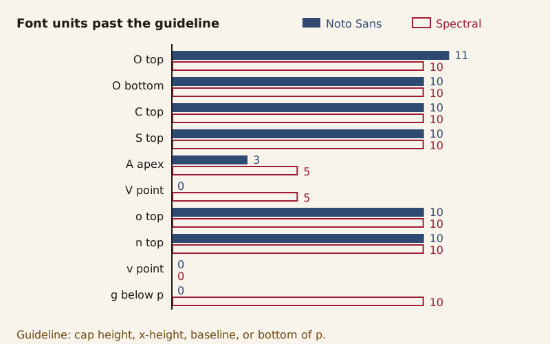
How far ten features cross their guideline, in font units, in Noto Sans Regular and Spectral Regular.
Lowercase letters do the same against the x-height. In both fonts the o and the arch of n rise 10 units above the flat x, and the o dips 10 units below the baseline.
Microsoft's standards add that, unlike other round letters, round descenders such as g often do not overshoot flat ones such as p. Noto Sans fits that description, with g and p both stopping at −240. Spectral's g drops 10 units lower than its p.
Some corrections are smaller still. In a comment included in the same standards, type designer Matthew Carter says he judges the sizes of round letters by eye. In his view, the openings in S and C make them look bigger than the closed O, so they often have to be drawn a little smaller. In Noto Sans, the C and S stop 1 unit short of the O's 725, while in Spectral all three reach 670.
Microsoft's standards also name H and O as the model capitals for spacing, the pair that type designers commonly test the other capitals against. Spacing is where the next set of numbers lives: the gaps between letters are measured on the kerning page.
Sources
- 1
Noto Sans, Version 2.015 (Regular, wght 400, wdth 100), by the Noto Project Authors, google/fonts repository, directory ofl/notosans at commit 94301472b4d8, with license file OFL.txt (SIL Open Font License, Version 1.1).
https://github.com/google/fonts/tree/94301472b4d809299b4775bc6502592b83dd6934/ofl/notosans (font file and license file)
- 2
Spectral, Version 2.005 (Regular, wght 400), by the Spectral Project Authors (Production Type), google/fonts repository, directory ofl/spectral at commit 94301472b4d8, with license file OFL.txt (SIL Open Font License, Version 1.1).
https://github.com/google/fonts/tree/94301472b4d809299b4775bc6502592b83dd6934/ofl/spectral (font file and license file)
- 3
Luca Pacioli, Divina proportione (Venice: Paganinus de Paganinus, 1509), page with the woodcut letter A; The Metropolitan Museum of Art, New York, accession number 19.50, Rogers Fund, 1919; image file "Divina proportione MET DP156941.jpg", Wikimedia Commons.
https://commons.wikimedia.org/wiki/File:Divina_proportione_MET_DP156941.jpg (page image and file description page (with the museum's record data))
- 4
Johnston, Edward. Writing & Illuminating, & Lettering. London: John Hogg, 1906. Project Gutenberg eBook #47089.
https://www.gutenberg.org/ebooks/47089 (pages 274–291, notes on the Roman Capitals and General Remarks on their characterisation)
- 5
Microsoft Typography, "Character design standards: Uppercase for Latin 1," Microsoft Learn, last updated 2022-06-09, with comments on visual character heights by Matthew Carter.
https://learn.microsoft.com/en-us/typography/develop/character-design-standards/uppercase (full text)
- 6
Microsoft Typography, "Character design standards: Lowercase for Latin 1," Microsoft Learn, last updated 2022-06-09.
https://learn.microsoft.com/en-us/typography/develop/character-design-standards/lowercase (full text)
- 7
Microsoft Typography, OpenType specification, "OS/2 — OS/2 and Windows Metrics Table," Microsoft Learn, last updated 2024-05-31.
https://learn.microsoft.com/en-us/typography/opentype/spec/os2 (sections sxHeight and sCapHeight)
- 8
FontForge documentation, "Typographical glossary" (FontForge 20251009 documentation), entries Ascender, Baseline, Cap-height, Descender, em, em unit, Overshoot and X-height; the Overshoot entry cites Peter Karow, Digital Formats for Typefaces.
https://fontforge.org/docs/glossary.html (entries Ascender, Baseline, Cap-height, Descender, em, em unit, Overshoot, X-height)
- 9
Google Fonts Knowledge, Glossary, entries "Ascenders & descenders," "Baseline," "Cap height," "Counter," "Em," "Overshoot," "Serif," "Stroke," "Terminal" and "X-height" (Creative Commons Attribution-ShareAlike 4.0).
https://fonts.google.com/knowledge/glossary (the ten entries named)
- 10
Elliot Jay Stocks, "An overview of Latin type anatomy," Google Fonts Knowledge (Creative Commons Attribution-ShareAlike 4.0).
https://fonts.google.com/knowledge/introducing_type/an_overview_of_latin_type_anatomy (full text)
- 11
Niteesh Yadav, "Type selection for AR/VR," Google Fonts Knowledge (Creative Commons Attribution-ShareAlike 4.0).
https://fonts.google.com/knowledge/using_type_in_ar_and_vr/type_selection_for_ar_vr (section Counters)
Download the data: glyph measurements for Noto Sans and Spectral (CSV) (Data: Measured from Noto Sans Version 2.015, Copyright 2022 The Noto Project Authors (https://github.com/notofonts/latin-greek-cyrillic), SIL Open Font License 1.1, retrieved 2026-10-16; Measured from Spectral Version 2.005, Copyright 2017 The Spectral Project Authors (https://github.com/productiontype/Spectral), SIL Open Font License 1.1, retrieved 2026-10-16)
Corrections
No corrections yet. Report an error through the corrections address in the page footer; every change is logged here as YYYY-MM-DD — what changed and why.
Decode next:
- X-Height: two fonts set at the same size, and how far apart their lowercase letters land when measured from the font files.
- Latin Alphabet: where the Roman capitals behind these part names came from, and why Z ended up last.
Cite this page
Codes & Letters. “Anatomy of a Letter: Why the O Is Drawn Taller Than the H.” Codes & Letters. Published 2026-10-16. Last substantive revision 2026-10-16. https://codesandletters.com/letterforms/anatomy/. Accessed [the date you read it].