Kerning: Space Six Words by Eye, Then Check the Font
Codes & Letters
- Published
- Last substantive revision
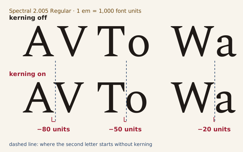
Three pairs drawn from the Spectral font file, with kerning off and on. The dashed line marks where the second letter would start without kerning; the red figure is the font's stored change.
Spectral's font file pulls capital A and V 80 units together. The font is drawn on a grid of 1,000 units per em, so that is 8% of the type size. Inside English words the font's adjustments mostly disappear: in three novels, 84% of the letter pairs that occur get none, and 96% of the rest move just 5 or 10 units.
Kerning is that adjustment: a value stored in the font file for one pair of letters, which opens or closes the gap between them. Tracking is different. It changes every gap in a line by the same amount, and CSS sets it with the letter-spacing property. The puzzle below sets six words three ways each: judge the gaps by eye, then check the values Spectral stores.
The puzzle: six words, three spacings each
Each word appears three times in Spectral 2.005 Regular, in rows A, B and C. Two rows have one gap opened or closed by 60 units; the third is the font's own spacing, kerning included.
- Take one word at a time. Its three rows start at the same point.
- Compare the gaps between the letters, not the letters themselves.
- Choose the most evenly spaced row, then check it against the answers.
The puzzle is built on a position this site holds, open to dispute: spacing matters more than the shapes of the letters, and kerning is the most underrated craft in typography.
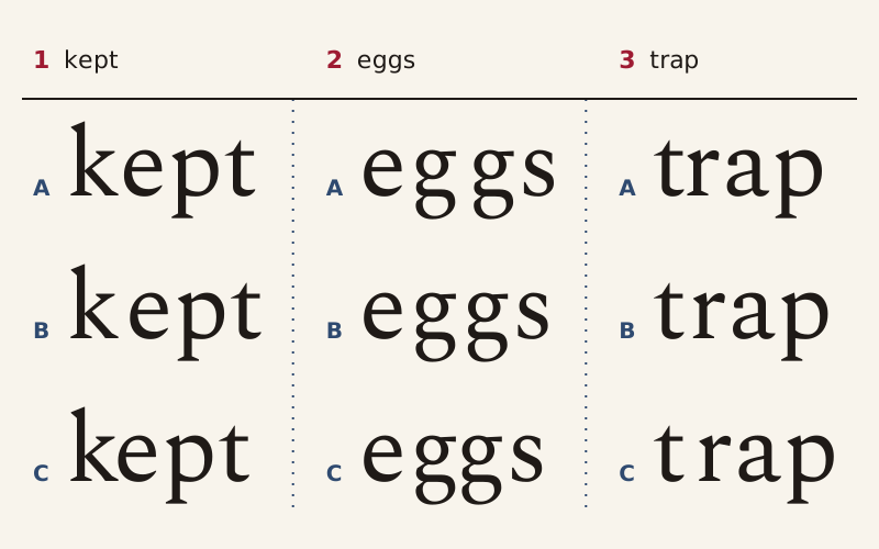
Words 1 to 3. The rows of each word start at the same point, so they differ only from the changed gap onward.
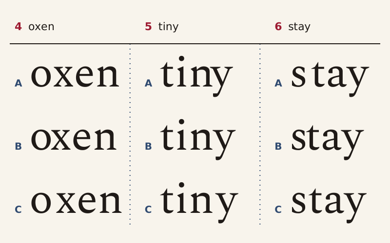
Words 4 to 6, set the same way. In each word, one row matches the spacing stored in the font.
Answers
| Word | Font's own spacing | Gap that changes | Spectral's value at that gap | The other two rows |
|---|---|---|---|---|
| 1 kept | A | k to e | −20 | B +40, C −80 |
| 2 eggs | B | g to g | −20 | A +40, C −80 |
| 3 trap | B | t to r | +10 | C +70, A −50 |
| 4 oxen | A | o to x | −10 | C +50, B −70 |
| 5 tiny | B | n to y | −10 | C +50, A −70 |
| 6 stay | C | s to t | −10 | A +50, B −70 |
Values are changes to the gap in font units, against the two letters set on their own widths; minus means closer. The answer key is the spacing recorded in the font, a design choice rather than a law of optics.
At the changed gap, Spectral moves the letters only 10 or 20 units, 1% to 2% of the type size; the wrong rows are 60 units off. In trap the font opens the gap, giving t and r 10 extra units. Other pairs carry small values too, such as −10 for g before s in eggs. The puzzle file in the downloads lists every pair.
Which letter pairs does Spectral kern most?
In Spectral 2.005, the largest kerning values go to pairs that start with a capital. F before A and Y before g or z close by 90 units, and A and V by 80 in either order. Of the 2,704 pairs that capital and lowercase a to z can form, 644 carry a value, and no lowercase letter followed by a capital gets one. Lowercase pairs stay small, from −30 for k before g to +10 for pairs such as t before r.
To see how often English text meets those values, this page matched them against the 1,580,730 letter pairs counted inside words in Pride and Prejudice, A Tale of Two Cities and Moby-Dick on the letter frequency page. The six most common pairs, th, he, in, er, an and re, get no kerning. The kerned pairs met most often are ha, ng and hi, each moved 5 units closer.
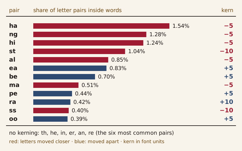
The 12 kerned pairs that occur most often inside words in the three novels, with Spectral's value for each. Red bars move letters closer; blue bars move them apart.
Across all the counted pairs, 11.49% move closer, 4.43% move apart and 84.08% stay put. Only 0.56% move 15 units or more, almost all of them pairs that start with k, led by ke at −20. Lowercase a and v get no adjustment in either order, while capital A and V get −80.
Two simplifications sit behind these shares. The counts fold capitals into lowercase, so a sentence-opening Th is counted as th and given the lowercase value. By default, Spectral also joins f with b, f, h, i, j, k, l or t into one ligature glyph, so those pairs, 0.53% of the total, are drawn as one shape and not kerned.
How is kerning different from tracking?
Every letter in a font carries its own space. In the OpenType specification, each glyph has an advance width, the distance from its own starting point to the start of the next glyph. Its left side bearing is the gap between its starting point and its outline, and the right side bearing is what remains. This spacing works letter by letter, with no knowledge of the neighbor.
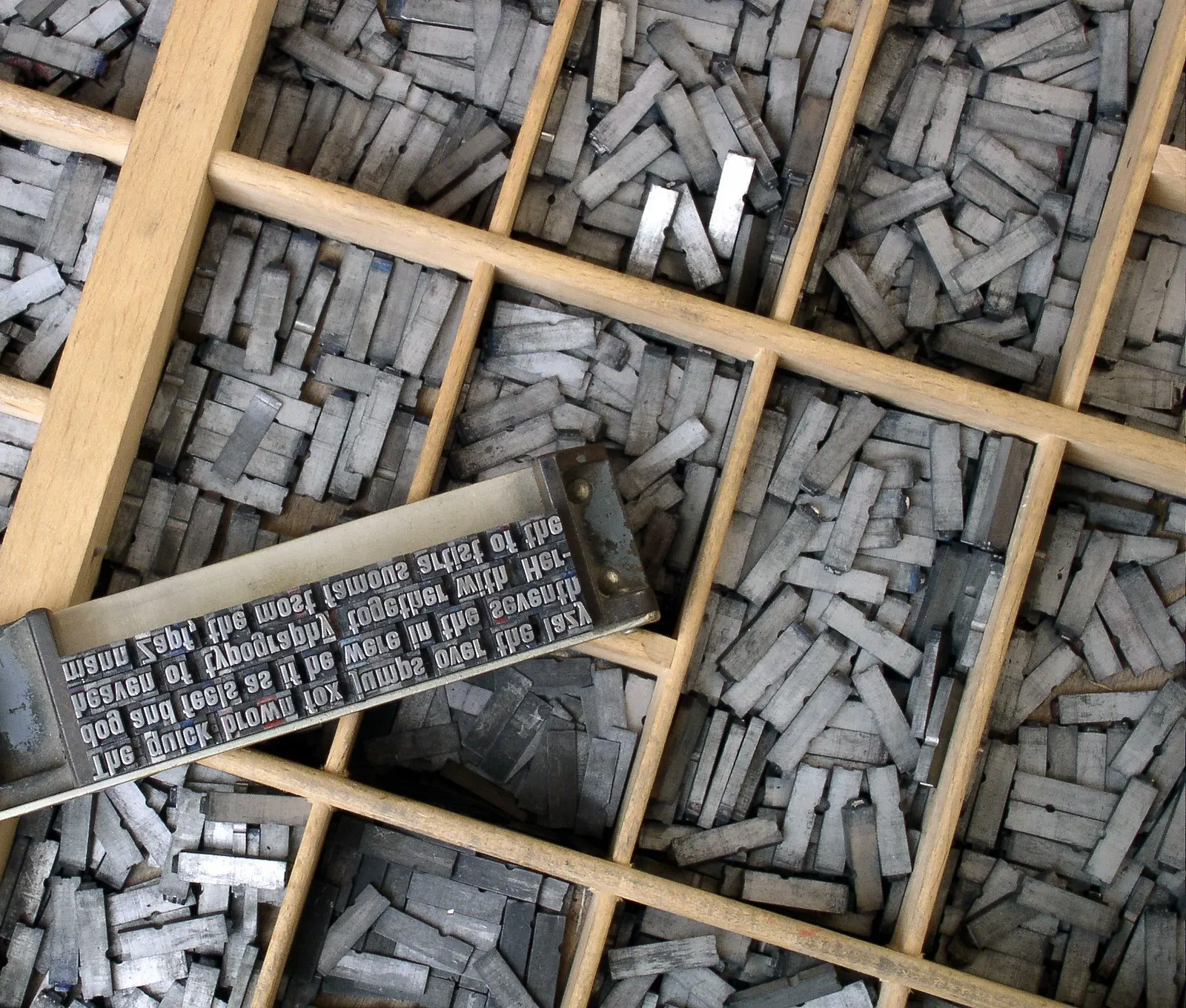

Metal type in a type case and a composing stick, each letter on a block of its own. In an OpenType font, each glyph carries its own advance width.
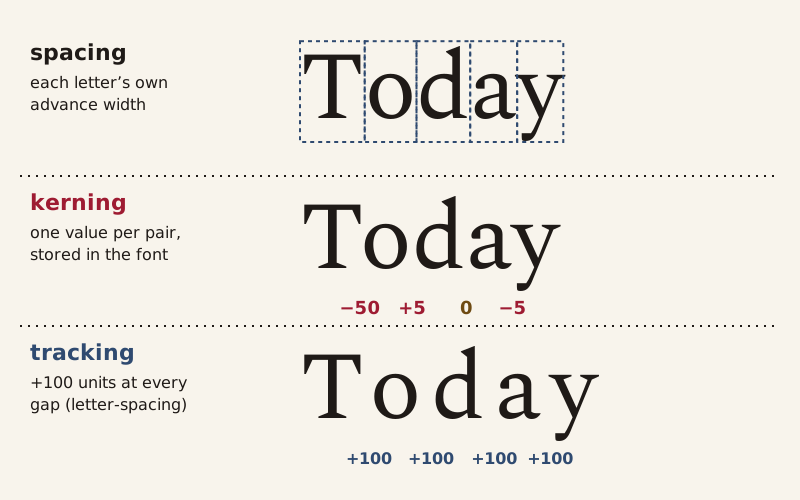
One word, three kinds of spacing. Tracking, set in CSS with letter-spacing, adds the same amount at every gap on top of the kerning.
Kerning adds corrections for particular neighbors. The W3C's CSS Fonts Module Level 4 draft defines it as "the contextual adjustment of inter-glyph spacing." The draft's font-kerning property controls the kerning data stored in the font, and the initial value, auto, leaves the choice to the browser. The OpenType feature registry recommends that kerning be on by default in most horizontal text, with a way for users to turn it off.
Tracking ignores pairs. CSS Text Module Level 3, a W3C Candidate Recommendation Draft of 14 August 2026, describes letter-spacing as "additional spacing (commonly called tracking)" between neighboring characters. It applies that spacing "in addition to kerning," so a tracked line keeps its kerning. The same draft advises browsers not to apply optional ligatures such as fi when letter-spacing is not zero, so that the letters can be spaced evenly.
Kerning values are stored in font units, which are fractions of the em. The CSS Fonts draft treats the type size as a scale factor on the em, so kerning grows and shrinks with the text. The x-height ruler measures letters against the same em. CSS applies both properties to text in any font, serif or sans serif.
Where is kerning stored in a font file?
In an OpenType font such as Spectral, kerning lives in the GPOS table, the glyph positioning table, under a feature tagged kern, which in Spectral points to pair adjustment lookups, type 2 in the specification. Format 1 of this type lists single pairs of glyphs; format 2 sorts glyphs into classes and stores one value for each pair of classes. The specification also allows an extension lookup, type 9, to hold subtables too large for the table's 16-bit offsets.
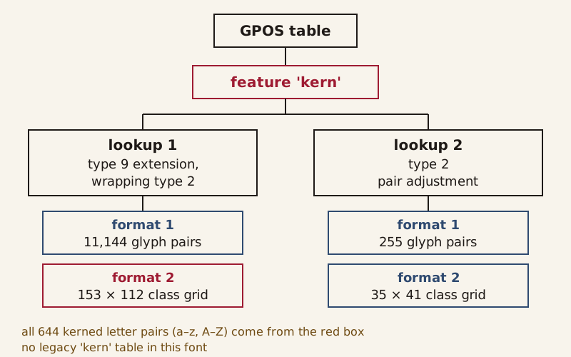
How Spectral 2.005 stores its kerning, with lookups numbered as in the font. Every kerned pair of plain letters takes its value from the red class grid.
Spectral 2.005 keeps its kerning in two such lookups and has no legacy kern table, the older kerning table the specification also describes. The larger lookup, wrapped in an extension lookup, lists 11,144 single glyph pairs and a grid of 153 by 112 classes, counting class 0; the smaller covers mostly punctuation, figures and symbols. All 644 kerned pairs of plain letters take their value from that one class grid.
A program read every kerning value on this page from the font file. A second program confirmed all 2,704 letter pairs by setting each one with the HarfBuzz text-shaping library, kerning on and off.
The pair counts behind the chart, with German and French pairs beside the English ones, are on the letter frequency page.
Sources
- 1
Spectral, Version 2.005 (static font Spectral-Regular.ttf), by the Spectral Project Authors, google/fonts repository, directory ofl/spectral at commit 94301472b4d8, with license file OFL.txt (SIL Open Font License, Version 1.1) and metadata file METADATA.pb.
https://github.com/google/fonts/tree/94301472b4d809299b4775bc6502592b83dd6934/ofl/spectral (font file, license file and metadata file)
- 2
Microsoft Typography. OpenType specification, "GPOS — Glyph Positioning Table" (OpenType 1.9.1). Microsoft Learn, last updated 2024-05-29.
https://learn.microsoft.com/en-us/typography/opentype/spec/gpos (sections on basic glyph positioning, the value record, lookup type 2 and lookup type 9)
- 3
Microsoft Typography. OpenType specification, "kern — Kerning" (OpenType 1.9.1). Microsoft Learn, last updated 2024-05-31.
https://learn.microsoft.com/en-us/typography/opentype/spec/kern (full page)
- 4
Microsoft Typography. OpenType specification, "Registered Features: Descriptions and Implementations (k – o)" (OpenType 1.9.1), feature tags kern and liga. Microsoft Learn, last updated 2024-05-31.
https://learn.microsoft.com/en-us/typography/opentype/spec/features_ko#tag-kern (entries for the feature tags kern and liga)
- 5
Microsoft Typography. OpenType specification, "hmtx — Horizontal Metrics Table" (OpenType 1.9.1). Microsoft Learn, last updated 2023-01-10.
https://learn.microsoft.com/en-us/typography/opentype/spec/hmtx (full page)
- 6
Chris Lilley, ed. CSS Fonts Module Level 4. W3C Working Draft, 7 September 2026, sections 2.5, "Font size: the font-size property," and 6.3, "Kerning: the font-kerning property." Copyright © 2026 World Wide Web Consortium. W3C® liability, trademark and permissive document license (https://www.w3.org/copyright/software-license/) rules apply.
https://www.w3.org/TR/2026/WD-css-fonts-4-20260907/#font-kerning-prop (sections 2.5 and 6.3)
- 7
Elika J. Etemad, Koji Ishii and Florian Rivoal, eds. CSS Text Module Level 3. W3C Candidate Recommendation Draft, 14 August 2026, section 7.2, "Tracking: the letter-spacing property." Copyright © 2026 World Wide Web Consortium. W3C® liability, trademark and permissive document license (https://www.w3.org/copyright/software-license/) rules apply.
https://www.w3.org/TR/2026/CRD-css-text-3-20260814/#letter-spacing-property (section 7.2)
- 8
Austen, Jane. Pride and Prejudice. Project Gutenberg eBook #1342, https://www.gutenberg.org/ebooks/1342 (text file retrieved via the gutenberg.pglaf.org mirror, 2026-10-16).
https://www.gutenberg.org/ebooks/1342 (letter-pair counts inside words, as published on the Letter Frequency page)
- 9
Dickens, Charles. A Tale of Two Cities. Project Gutenberg eBook #98, https://www.gutenberg.org/ebooks/98 (text file retrieved via the gutenberg.pglaf.org mirror, 2026-10-16).
https://www.gutenberg.org/ebooks/98 (letter-pair counts inside words, as published on the Letter Frequency page)
- 10
Melville, Herman. Moby-Dick; or, The Whale. Project Gutenberg eBook #2701, https://www.gutenberg.org/ebooks/2701 (text file retrieved via the gutenberg.pglaf.org mirror, 2026-10-16).
https://www.gutenberg.org/ebooks/2701 (letter-pair counts inside words, as published on the Letter Frequency page)
Download the data: kerned letter pairs in Spectral (CSV) (Data: Spectral Version 2.005, Copyright 2017 The Spectral Project Authors (https://github.com/productiontype/Spectral), SIL Open Font License 1.1, retrieved 2026-10-16) · English letter pairs and their kerning (CSV) (Data: Spectral Version 2.005, Copyright 2017 The Spectral Project Authors (https://github.com/productiontype/Spectral), SIL Open Font License 1.1, retrieved 2026-10-16) · puzzle spacings and answers (CSV) (Data: Spectral Version 2.005, Copyright 2017 The Spectral Project Authors (https://github.com/productiontype/Spectral), SIL Open Font License 1.1, retrieved 2026-10-16)
Corrections
No corrections yet. Report an error through the corrections address in the page footer; every change is logged here as YYYY-MM-DD — what changed and why.
Decode next:
- Letter Frequency: the English, German and French letter counts, book by book, and the English pair counts these shares come from.
- Anatomy of a Letter: the named parts of a letter, measured in Spectral's own font units.
Cite this page
Codes & Letters. “Kerning: Space Six Words by Eye, Then Check the Font.” Codes & Letters. Published 2026-10-16. Last substantive revision 2026-10-16. https://codesandletters.com/letterforms/kerning/. Accessed [the date you read it].