Serif vs Sans Serif: Reading Tests Found No Clear Winner
Codes & Letters
- Published
- Last substantive revision
LetterformSpec card
- Part or effect
- SerifSource: Johnston, Writing & Illuminating, & Lettering (1906); Perea (2013)
- Typeface measured (version)
- Noto Serif 2.015 Regular (wght 400, wdth 100)Source: Noto Serif font file, SIL Open Font License 1.1
- Measurement
- x-height 536 and cap height 714 of 1,000 units; H stem 101, crossbar 50, foot 291Source: this page's measurement of the font file
- Comparison typeface
- Noto Sans 2.015 Regular: x-height 536, cap height 714; H stem 90, crossbar 79, foot 90Source: this page's measurement of the font file
serif-vs-sans-serif-spec.csv the values on this card, as CSVData: Measured from Noto Serif Version 2.015, Copyright 2022 The Noto Project Authors (https://github.com/notofonts/latin-greek-cyrillic), SIL Open Font License 1.1, retrieved 2026-10-16; Measured from Noto Sans Version 2.015, Copyright 2022 The Noto Project Authors (https://github.com/notofonts/latin-greek-cyrillic), SIL Open Font License 1.1, retrieved 2026-10-16
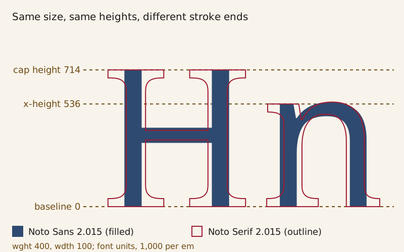
Noto Serif's H and n drawn over Noto Sans at the same size. The two fonts share their heights; the serif version adds feet and a thinner crossbar.
Twenty-four students in Valencia read sentences in Lucida and in Lucida Sans while a camera tracked their eyes. Apart from a slight difference in the number of forward eye movements, the serifs changed nothing the camera measured.
That 2013 test, by Manuel Perea of the University of Valencia, fits a wider pattern: when an experiment changes only the serifs, neither style has come out clearly ahead overall. A 2025 review of 42 studies reached the same verdict: serifs are not a significant legibility factor. One test on this page did find a clear winner, Verdana over Georgia. But the two typefaces differed in more than their serifs.
What is the difference between serif and sans serif type?
A serif is a short finishing stroke at the end of a main stroke, like the feet at the bottom of the capital H in a serif typeface. Edward Johnston's 1906 lettering manual files serifs under "SERIFS or FINISHING STROKES." Perea's paper describes them as small ornaments where strokes end. Sans serif type leaves them off.
Noto Serif and Noto Sans make a clean pair for a comparison because their heights match. Both come from the Noto Project Authors under the SIL Open Font License. Measured from the font files at regular weight, each has an x-height, the height of a lowercase x, of 536 units on a grid of 1,000 units per em. Each also has a cap height of 714 units, a d that rises to 760 and a p that drops to −240.
Heights are where the match ends. In Noto Serif, the capital H has stems 101 units wide and a crossbar 50 units thick, so its uprights are about twice as heavy as its bar. In Noto Sans, the same strokes measure 90 and 79. Legibility studies call this difference between thick and thin strokes stroke contrast.
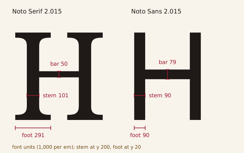
The capital H of Noto Serif 2.015 and Noto Sans 2.015, both 714 units tall. The serif H has thicker stems, a thinner crossbar and feet 291 units wide.
The o shows the same pattern: 97 units at the sides and 53 at the top in Noto Serif, against 91 and 74 in Noto Sans. Set the lowercase alphabet in each font and the Noto Serif line runs about 3.6% longer, by this page's measurement of the advance widths. The other parts these strokes meet, from stems to terminals, are named on Anatomy of a Letter.
Where did serifs come from: brush or chisel?
The letters at the center of this argument are carved on the base of Trajan's Column in Rome. James Grout's Encyclopaedia Romana calls that inscription the model for all later Roman capital letterforms and dates the column's dedication to May AD 113. Johnston's 1906 manual dates the inscription to about AD 114. The photograph here shows a plaster cast of the base in the National Museum of Romanian History in Bucharest, not the stone in Rome.
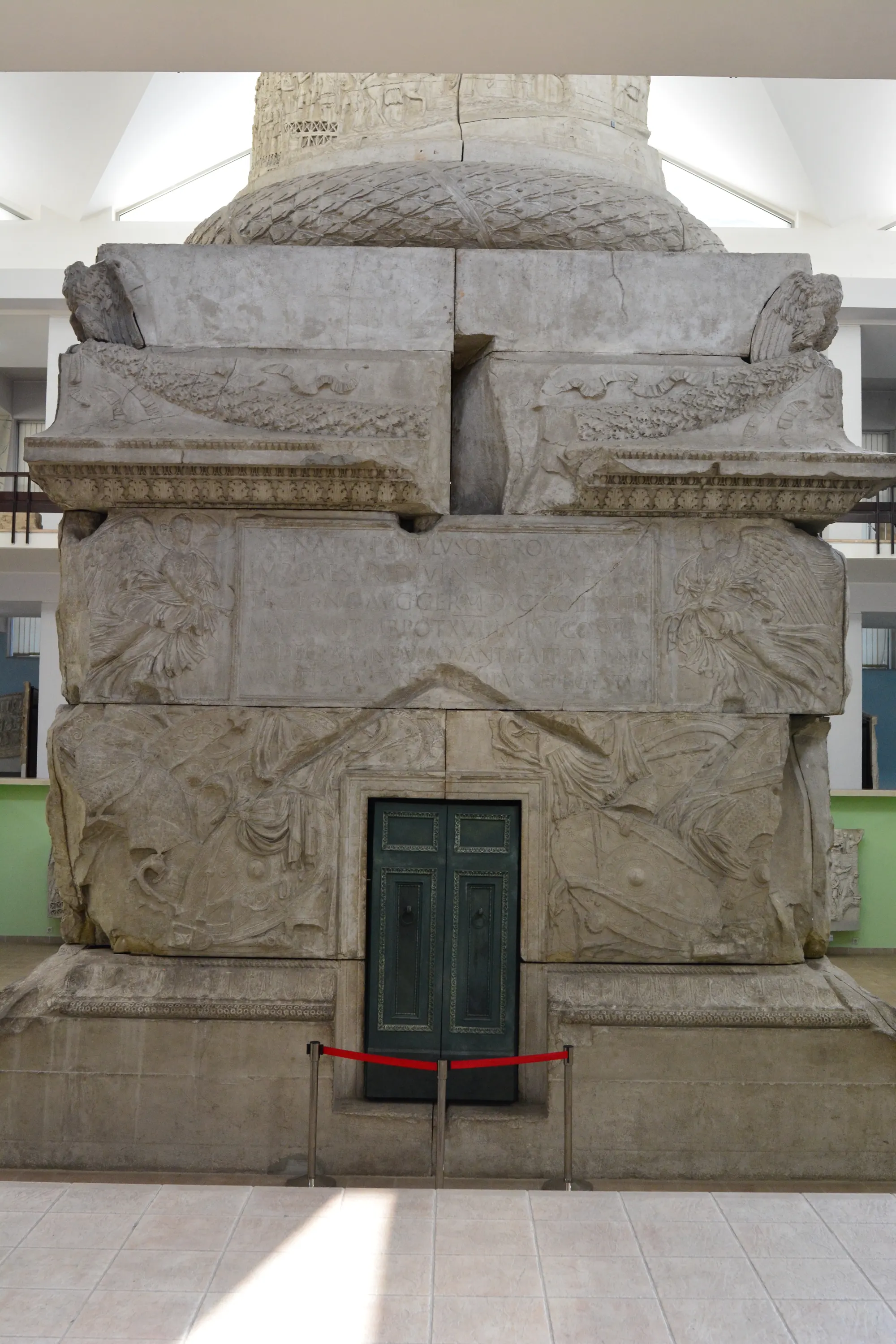

A plaster cast of the base of Trajan's Column in the National Museum of Romanian History, Bucharest. The inscription panel sits above the door, between two winged figures.
One account says the letters were painted before they were cut. In his editor's preface to Johnston's manual, W. R. Lethaby wrote that Roman capitals "must have been formed by incessant practice with a flat, stiff brush, or some such tool." He supposed that most of the great inscriptions were designed by a master writer and only cut in by the mason.
Johnston wrote that the fine early inscriptions "are supposed to have been first drawn or painted (in outline) and then cut into the stone." Grout reports the hypothesis of Father Edward Catich, author of The Origin of the Serif (1968): each letter was sketched with a flat, square-tipped brush in three or four strokes, then cut into the stone by the same person.
The other account credits the chisel. In a chapter of the same 1906 manual, the carver A. E. R. Gill described cutting a plain letter in stone. Once the ends of the strokes are made clean, he wrote, "there is a tendency to spread them into Serifs."
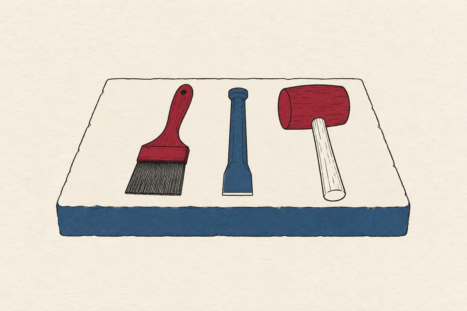 Generated illustration
A flat, square-tipped brush, a chisel and a mallet. One account says Roman letters were painted before they were cut; the other credits the chisel with the serif.
The FontForge glossary gives another reason tied to stone. It says the Romans added fine lines at the ends of the main stems to reduce the chance of the stone cracking. In a 2015 review of The Eternal Letter for Eye magazine, James Clough described Catich's book as arguing against writers who traced the forms to the chisel. Among them were Nicolete Gray, Albert Kapr, Eric Gill and Frederic W. Goudy.
This site treats the origin of serifs as an open question. Both accounts are in print, sometimes between the same covers, and the sources on this page do not settle it.
When did the first sans serif type appear?
Letters without serifs are older than sans serif type. James Mosley, a historian of printing, writes that Greek inscriptions of the fifth century BC were cut in strokes of even thickness, with end strokes added early in the following century. Inscriptions of the Roman republic, he notes, often had small serifs or none. By 1816, he writes, sans serif letters had already appeared in printed matter for ten years.
As printing type, the style turns up in a specimen issued in about 1816 by the London typefounder William Caslon IV. Mosley calls it "the first sanserif type." Its first known appearance, he writes, is "a setting of a few words under the heading 'Two Lines English Egyptian'." His essay's editors add that Two Lines English named the body size, about 28 points on the later Anglo-American system, and that Egyptian was the type's name.
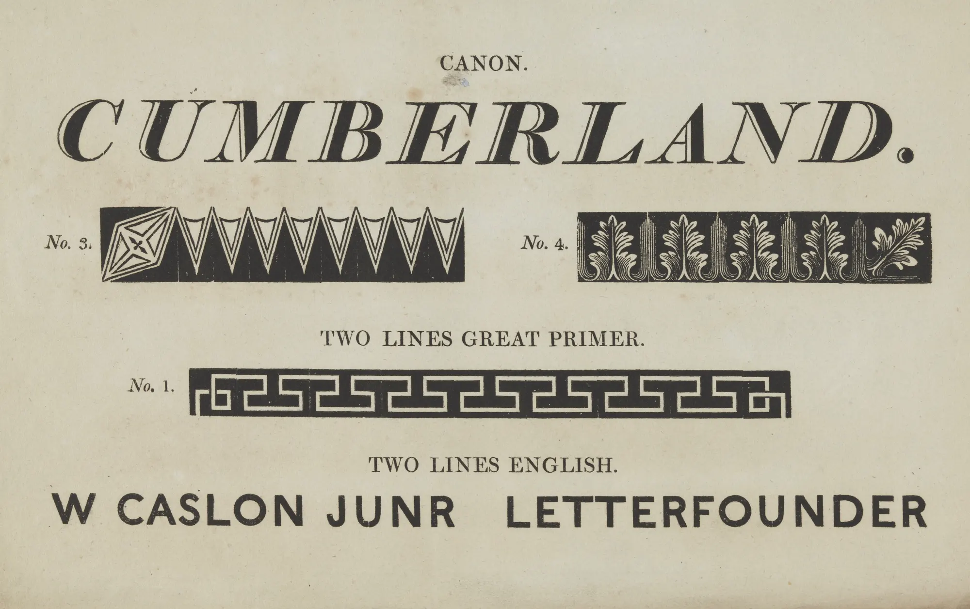
Image credit and license (full text)
"Caslon Two Lines English Egyptian" by William Caslon IV — Public domain (type specimen printed in London about 1816 by the typefounder William Caslon IV, who died in 1869: public domain in the US (published before 1931) and in the EU (author dead for more than 70 years); a faithful scan of a flat page adds no new rights in the US (Bridgeman principle) or the EU (DSM Directive Article 14); Commons PD-old-70-1923) — https://commons.wikimedia.org/wiki/File:Caslon_Two_Lines_English_Egyptian.jpg
A page of William Caslon IV's type specimen, dated to about 1816. Below the italic serif CUMBERLAND, the foundry's name, W CASLON JUNR LETTERFOUNDER, is set in sans serif capitals.
In the copy reproduced here, the words are the foundry's own name, set under the size heading Two Lines English. No use of Caslon's type at the time is known, Mosley writes. In his account, sans serif type caught on with printers only in the 1830s, through Vincent Figgins's "Sans-serif" and Thorowgood's "Grotesque."
What did the reading tests find?
The tests here that hold everything but the serifs steady found no overall difference. Perea's students read one-line Spanish sentences on a screen in 14-point Lucida or Lucida Sans, two members of one font family. A sentence took 2,370 ms on average in the serif version and 2,392 ms in the sans. That gap was not statistically significant (p = .32).
Sofie Beier and Mary Dyson tested single letters printed on white paper and viewed at a distance. Their two typeface styles, OvinkSans and OvinkSerif, were identical except for added slab serifs. The letters were identified equally well overall. As a group, the letters with serifs at the top and bottom of their stems, l, b, h, n and u, were identified significantly better in the serif version.
A 2022 study by Sara Vecino and colleagues, which this site read only in abstract, gave 246 volunteers tasks on an e-commerce website prototype. Serif and sans serif versions of one font family made no difference to reading speed or to user preference. Women, though, tended to prefer the serif version.
| Study | Readers | Type compared | Result |
|---|---|---|---|
| Perea 2013, eye tracking, one-line sentences on screen | 24 Spanish-speaking students | Lucida vs Lucida Sans (one family) | 2,370 vs 2,392 ms per sentence, not significant; only forward eye movements differed, slightly |
| Beier and Dyson 2013, single letters on paper at a distance | Number not given in the copy read | OvinkSans vs OvinkSerif (identical except for slab serifs) | No overall difference; l, b, h, n, u as a group identified better with serifs |
| Franken, Podlesek and Možina 2015, texts on a 24-inch LCD | 48 readers aged 17 to 47, texts in Slovene | Georgia vs Verdana (two families), 8 sizes | Verdana faster at every size; 19.61 vs 18.13 characters per second on average |
| Vecino et al. 2022, e-commerce prototype (abstract) | 246 volunteers | Serif vs sans serif versions of one family | No effect on reading speed or user preference |
| Ho Sang and Petrarca 2025, systematic review | 42 studies from 2000 to 2025; 19 compared serif and sans serif | 52 typefaces in all | Serifs not a significant legibility factor; no study showed a difference due solely to serifs |
A clear winner did turn up in a test of two separate typefaces. Researchers at the University of Ljubljana had 48 people aged 17 to 47 read short Slovene texts in Georgia and Verdana at eight sizes from 16 to 32 pixels. Verdana was read faster at every size, averaging 19.61 characters per second against 18.13 for Georgia, or about 8% faster by this page's arithmetic. The authors put the difference down to Verdana's even stroke width, its slightly larger x-height and its wider letters.
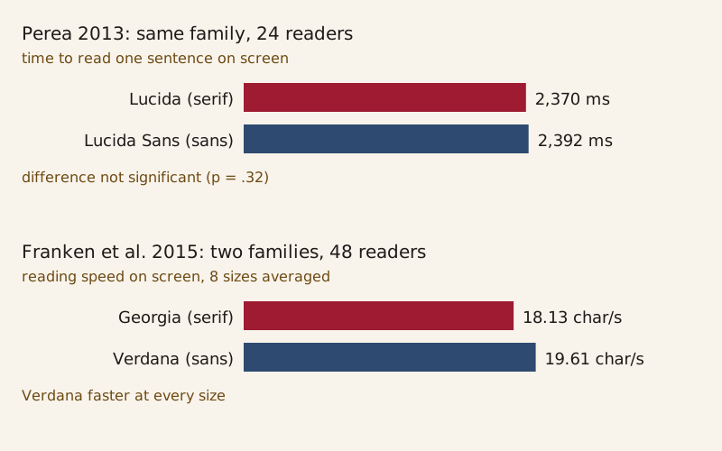
Two reading-speed results. Lucida and Lucida Sans, from one family, were read at about the same speed; Verdana was read faster than Georgia, two typefaces that differ in more than their serifs.
In print, the results here are mixed rather than a clear serif win. Beier and Dyson's printed letters showed no overall difference, apart from the gain for the group with serifs at both ends of their stems. Brian Ho Sang and Diana Petrarca's 2025 review counted one print study in which serif type improved reading speed, against three such results on screens. In just over half of the studies that compared the two styles, the review found no effect or inconclusive results.
On screens, the results point both ways. The same-family tests by Perea and Vecino found no difference. Franken's team found Verdana faster than Georgia, and the review's three on-screen studies found serif type faster.
Why do some tests find a winner?
Whole typefaces differ in more than serifs. The 2023 online edition of Mary Dyson's book on legibility lists what else changes between existing serif and sans serif faces. The list runs from the thickness of stems and the lengths of ascenders and descenders to character widths and the ratio of thin to thick strokes. Perea judged that a test of Times New Roman against Helvetica would not isolate the serifs, for the same reason: the two typefaces differ in other ways that could affect reading.
Letter size is one such difference. Beier and Dyson give the example of two typefaces set at 32 points, one with letters 8 mm tall and the other 6 mm. Equal point size, they conclude, is "not an appropriate means of comparing different typefaces."
Ten of the thirteen open fonts measured on the X-Height page, all but the three monospaced ones, show the spread. At one font size, the lowercase x stands anywhere from 40.5% of that size in EB Garamond to 54.6% in Inter.
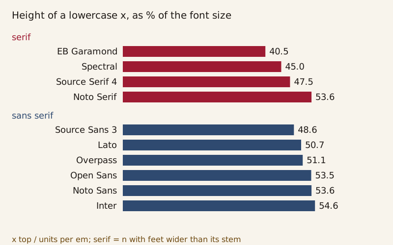
x-height as a share of font size in ten open fonts, split by whether each font's n has serifs. The serif and sans serif ranges overlap; Noto Serif and Noto Sans match at 53.6%.
The four serif fonts span 40.5% to 53.6%, and the six sans serif fonts 48.6% to 54.6%. Pick one serif and one sans serif from that list and set them at the same size, and the test may also pit small letters against large ones. Noto Serif and Noto Sans avoid that trap at 53.6% each. Their stroke contrast still differs, as the H measurements earlier on this page show.
These numbers say nothing about which x-height reads better. They show only that a serif-versus-sans test at one font size can carry a size difference with it. Letter spacing also changes from font to font, and Kerning measures it pair by pair.
Why hasn't the question been settled?
Ho Sang and Petrarca call the results inconsistent. Whether serifs help, they suggest, may depend on the reader and the context. Their review names familiarity as a possibly significant factor and calls for research on design features beyond serifs. It also concludes that no one type size or typeface reads best for everyone in every situation.
A 2022 study by Shaun Wallace and colleagues, read here only in abstract, points the same way. It compared fonts in general rather than serifs as such. Hundreds of crowdsourced participants took part, with font size normalized by perception, and reading speed rose 35% between the fastest and slowest fonts without a loss in comprehension. The authors write that the high variability across fonts suggests one font does not fit all.
Dyson's book rejects two common explanations for a serif advantage and counts a third, that serifs make letters more distinct, as possible. She finds no evidence that serifs hold letters together in words or words together in lines. Serifs probably do not steer the eye along a line, she argues, because their fine detail is mostly lost in peripheral vision, which the eye uses to pick its next landing point. Perea, whose sentences were single lines, left open whether serifs help the eye find the next line of a paragraph.
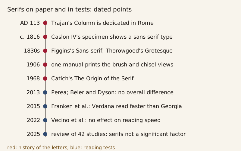
Dated points in this page's story, from the dedication of Trajan's Column in AD 113 to a 2025 review of 42 reading studies.
Perea's starting point was a style rule. The 2010 publication norms of the American Psychological Association asked for a serif font such as Times New Roman. Perea concluded that there was no reason for the rule other than uniformity in how manuscripts are presented.
X-Height measures how far letter size moves between thirteen open fonts set at one size. The alphabet behind Trajan's capitals has its own history on Latin Alphabet.
Sources
- 1
Noto Serif, Version 2.015 (variable font NotoSerif[wdth,wght].ttf, measured at wght 400 and wdth 100), by the Noto Project Authors, google/fonts repository, directory ofl/notoserif at commit 94301472b4d8, with license file OFL.txt (SIL Open Font License, Version 1.1).
https://github.com/google/fonts/tree/94301472b4d809299b4775bc6502592b83dd6934/ofl/notoserif (font file and license file)
- 2
Noto Sans, Version 2.015 (variable font NotoSans[wdth,wght].ttf, measured at wght 400 and wdth 100), by the Noto Project Authors, google/fonts repository, directory ofl/notosans at commit 94301472b4d8, with license file OFL.txt (SIL Open Font License, Version 1.1).
https://github.com/google/fonts/tree/94301472b4d809299b4775bc6502592b83dd6934/ofl/notosans (font file and license file)
- 3
google/fonts repository at commit 94301472b4d8: font files and METADATA.pb of EB Garamond 1.003, Spectral 2.005, Source Serif 4 4.004, Noto Serif 2.015, Source Sans 3 3.052, Lato 2.015, Overpass 4.000, Open Sans 3.003, Noto Sans 2.015 and Inter 4.001, each under the SIL Open Font License 1.1.
https://github.com/google/fonts/tree/94301472b4d809299b4775bc6502592b83dd6934/ofl (font files and the category field of each METADATA.pb)
- 4
Manuel Perea. 2013. Why does the APA recommend the use of serif fonts? Psicothema 25(1): 13–17. https://doi.org/10.7334/psicothema2012.141
https://www.psicothema.com/pdf/4073.pdf (full text)
- 5
Sofie Beier and Mary C. Dyson. 2013. The Influence of Serifs on 'h' and 'i': Useful Knowledge from Design-led Scientific Research. Visible Language 47(3), issue dated 2014.
https://journals.uc.edu/index.php/vl/article/view/5875 (journal PDF; part of the method section is missing from the scanned copy)
- 6
Gregor Franken, Anja Podlesek and Klementina Možina. 2015. Eye-tracking Study of Reading Speed from LCD Displays: Influence of Type Style and Type Size. Journal of Eye Movement Research 8(1): 3, 1–8. https://doi.org/10.16910/jemr.8.1.3
https://bop.unibe.ch/JEMR/article/view/2395 (full text)
- 7
Sara Vecino, Jonas Mehtali, Javier de Andrés, Martin Gonzalez-Rodriguez and Daniel Fernandez-Lanvin. 2022. How does serif vs sans serif typeface impact the usability of e-commerce websites? PeerJ Computer Science 8: e1139. https://doi.org/10.7717/peerj-cs.1139
https://doi.org/10.7717/peerj-cs.1139 (abstract)
- 8
Shaun Wallace, Zoya Bylinskii, Jonathan Dobres, Bernard Kerr, Sam Berlow, Rick Treitman, Nirmal Kumawat, Kathleen Arpin, Dave B. Miller, Jeff Huang and Ben D. Sawyer. 2022. Towards Individuated Reading Experiences: Different Fonts Increase Reading Speed for Different Individuals. ACM Transactions on Computer-Human Interaction 29(4): 1–56. https://doi.org/10.1145/3502222
https://doi.org/10.1145/3502222 (abstract)
- 9
Edward Johnston. Writing & Illuminating, & Lettering. The Artistic Crafts Series of Technical Handbooks, edited by W. R. Lethaby (editor's preface), with Chapter XVII, Inscriptions in Stone, by A. E. R. Gill. London: John Hogg, 1906. Project Gutenberg eBook #47089.
https://www.gutenberg.org/ebooks/47089 (editor's preface (pages ix–x), pages 288–292, Chapter XVII pages 391–392, and the notes to Plates I and II (pages 409–410))
- 10
William Caslon IV. Type specimen page with Two Lines English and W CASLON JUNR LETTERFOUNDER, London, about 1816 (Columbia University copy). Wikimedia Commons, File:Caslon Two Lines English Egyptian.jpg.
https://commons.wikimedia.org/wiki/File:Caslon_Two_Lines_English_Egyptian.jpg (file page and the image)
- 11
Joe Mabel. Trajan's Column - NMR - base - 02 (photograph of the plaster cast of the base of Trajan's Column, National Museum of Romanian History, Bucharest, taken 2024-10-04). Wikimedia Commons.
https://commons.wikimedia.org/wiki/File:Trajan%27s_Column_-_NMR_-_base_-_02.jpg (file page and the image)
- 12
Brian Ho Sang and Diana Petrarca. 2025. Beyond (Type)Face Value: A Systematic Literature Review Examining Design Factors Influencing the Legibility and Readability of Typography. Visible Language 59(3).
https://journals.uc.edu/index.php/vl/article/view/8855 (full text)
- 13
Mary C. Dyson. 2023. Legibility: How and why typography affects ease of reading. Digital edition (Design Regression, with Google Fonts), chapter 5, Overview of research: Type.
https://legible-typography.com/en/5-overview-of-research-type (chapter 5, sections Serif versus sans serif and Panel 5.2)
- 14
James Mosley. The first sanserif type. ABYME, published online 2023-11-30.
https://www.abyme.net/revue/thefirstsanseriftype/ (full text)
- 15
James Grout. Trajan's Column. Encyclopaedia Romana, penelope.uchicago.edu.
https://penelope.uchicago.edu/encyclopaedia_romana/imperialfora/trajan/column.html (full text)
- 16
James Clough. A Roman legacy. Eye no. 90, vol. 23 (2015), review of The Eternal Letter (MIT Press).
https://www.eyemagazine.com/review/article/a-roman-legacy (full text)
- 17
FontForge documentation, Glossary, Serif.
https://fontforge.org/docs/glossary.html#serif (glossary entry)
Download the data: Noto Serif and Noto Sans measurements (CSV) (Data: Measured from Noto Serif Version 2.015, Copyright 2022 The Noto Project Authors (https://github.com/notofonts/latin-greek-cyrillic), SIL Open Font License 1.1, retrieved 2026-10-16; Measured from Noto Sans Version 2.015, Copyright 2022 The Noto Project Authors (https://github.com/notofonts/latin-greek-cyrillic), SIL Open Font License 1.1, retrieved 2026-10-16)
Corrections
No corrections yet. Report an error through the corrections address in the page footer; every change is logged here as YYYY-MM-DD — what changed and why.
Decode next:
- X-Height: thirteen open fonts measured at one font size, from the small x of EB Garamond to the large one of JetBrains Mono.
- Latin Alphabet: the capitals on Trajan's Column belong to an alphabet that grew from 21 letters to 26 and sent Z to the end.
Cite this page
Codes & Letters. “Serif vs Sans Serif: Reading Tests Found No Clear Winner.” Codes & Letters. Published 2026-10-16. Last substantive revision 2026-10-16. https://codesandletters.com/letterforms/serif-vs-sans-serif/. Accessed [the date you read it].